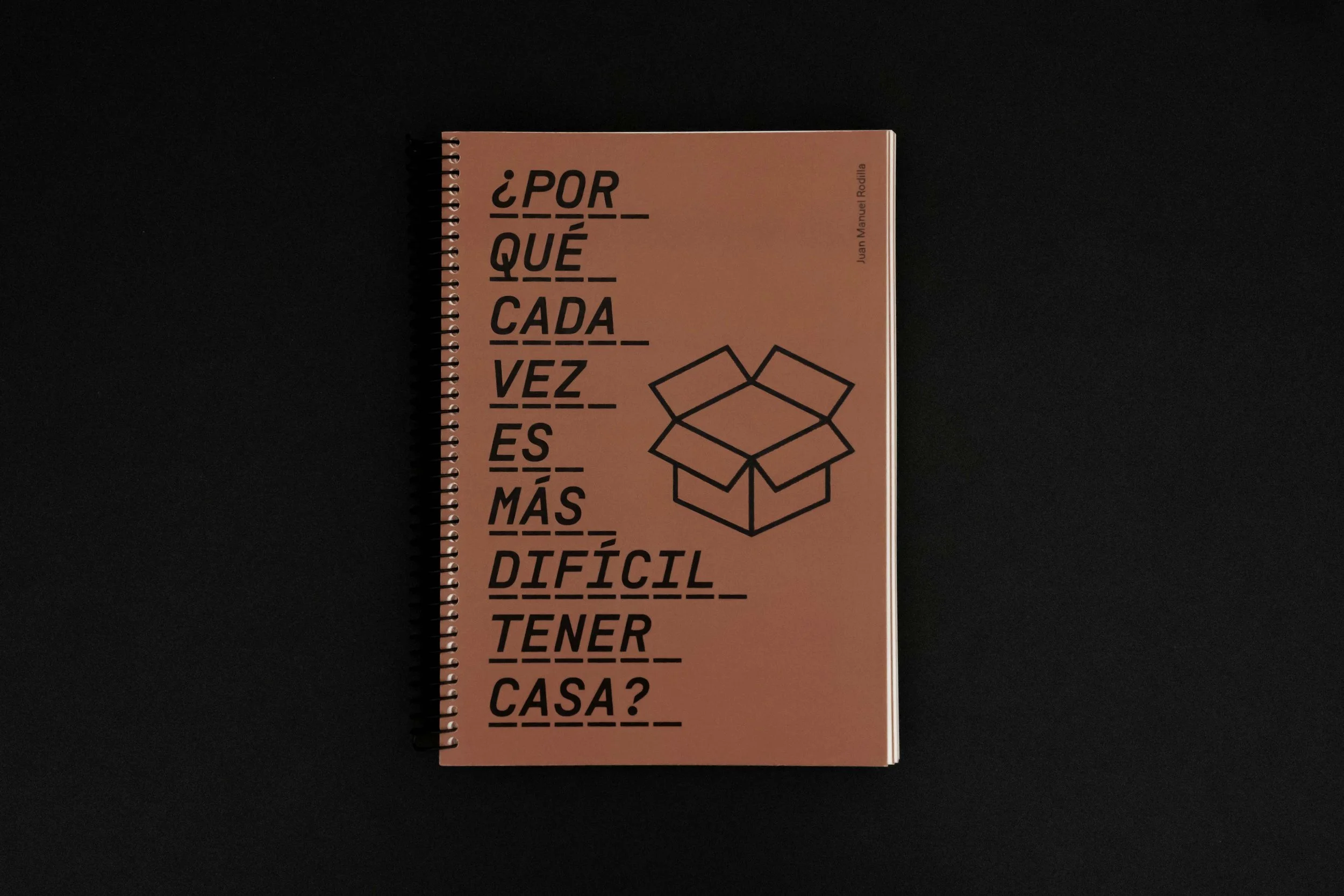
¿Por qué cada vez es más difícil tener casa?
Juan Manuel Rodilla / 2025
design / printing
20 prints

The publication addresses contemporary housing access problems from an analytical and critical perspective, but in a didactic and accessible style for all audiences. It is replete with icons that facilitate understanding through simple conceptual frameworks.
Regarding the graphic and editorial identity, it is based on the concept of the experience of homelessness, using two elements: the cardboard box and the cobblestones of public pavement. On the one hand, cardboard boxes can serve to cushion the hardness of the pavement, as an improvised mattress or blanket to protect oneself from the cold, or to facilitate the constant moves of those who lack stability. On the other hand, the cobblestones are also reflected in the choice of typographic elements, through the discontinuous underlines that force the letters to move and separate above them. Colorimetrically, gray and brown, colors linked to these elements of the everyday experience of homelessness, give shape and meaning to the publication. During the reading of the book, some separate sections are designed as visual cues that give rhythm and conceptual power to the reading experience.